There is no shortage of companies that follow popular design trends to appeal to a mass market. Much more rare is the breed of company that actually sets design trends. Today we’ll examine the techniques of a company that occupies the top of the design food chain: Apple.
Below you’ll find 15 practical ways to follow Apple’s example in creating beautiful interfaces.
#1: Keep it Simple
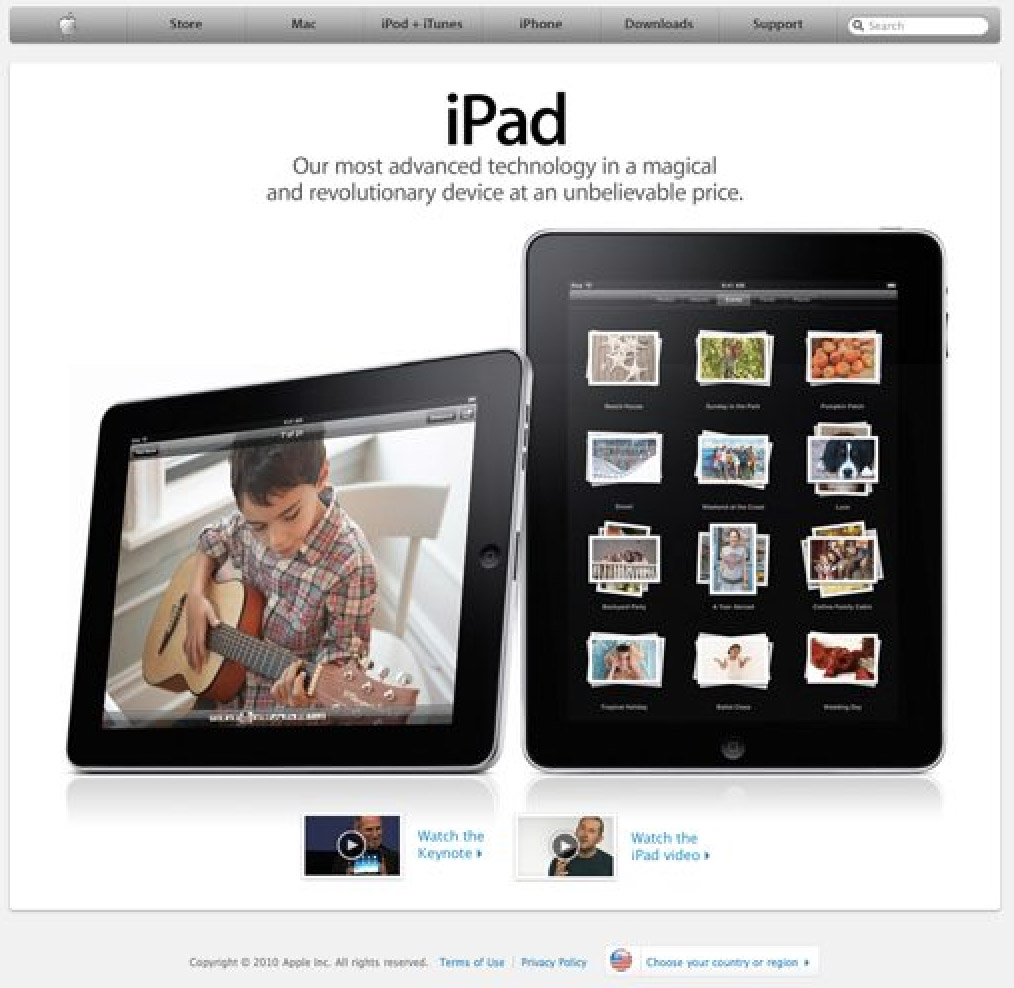
Take a look at Apple’s homepage and don’t think about what you see, but what you don’t see. I’ll give you a hint, it’s all over this site (no not this very site, click the link silly). The answer of course is visual clutter. A homepage is supposed to tell users everything about your company, to communicate all your product categories in detail, to list endless features, and to showcase your logo as big as possible. Right? According to Apple: wrong.
Apple’s homepage simply shows off their most recent work and provides you with a few easily understood categories to help you get to the information you want to see. Granted, odds are you aren’t designing for a remarkably ubiquitous company that needs no introduction. However, you can still use minimal but attractive design to increase usability.
Imagine you’re driving up to an airport. As you drive along you are simultaneously hit with five or six signs containing maps with the locations for everything from terminals right down to handicap accessible restrooms. The argument the map designer would make is that he gave you all the information you needed to get anywhere you wanted to go. You would no doubt quip back that his fault was in giving it to you all at once as you were driving by at 20 mph. Now imagine you are at Sky Harbor, Phoenix Arizona’s remarkably easy-to-navigate airport. As you pull in you see a sign that says “Hello, welcome to Sky Harbor. There are three terminals”. Then as you drive along, you reach more signs, each with a brief description of what airlines fly into each terminal and where to go for arrivals or departures. The feeling you get as you drive into Sky Harbor is “Wow, this is easy!”
Apple takes the same approach to interface design. Rather than hitting you with everything they’ve got in the name of usability, they use smaller bits of information to lead you to the place that holds the content you’re really after. Look at the site you’re working on and consider how you can break the complex information up into smaller pieces that the user won’t find overwhelming.
#2: Use Amazing Product Shots
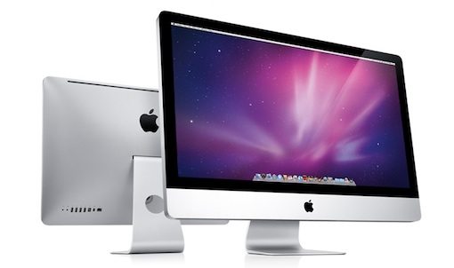
One of Apple’s principle reasons for cutting back on superfluous graphics on their site is to really showcase what’s important: their products. Just look at the shots they use; it’s nearly impossible to look at a page on the Apple site and not have your eyes focus on the products for seconds on end.
There are several things that make these products look so incredible. The first is that they are obviously pristine. Chalk this one up to digital imaging experts. I haven’t seen exactly how they do it, but the combination is likely a mixture of photography, 3D modeling (take your pick: Modo, Lightwave, Maya, etc.), and of course, Photoshop.
The next thing they do is to make them take up a huge portion of the page. If you spend hours making a beautiful package shot and then size it down to a thumbnail, it’s simply not as overwhelmingly impressive. Notice that Apple also frequently includes multiple products arranged in an attractive way as in the picture above.
The lesson here is to not just take a photo of your product and call it a day. Spend the time to make it look fantastic. Whether it’s a can of refried beans or a Lexus, do your best to make a great hero shot.
#3: Contrast is Key

Another thing that makes those Apple product shots look so darn great is the simple environment they drop them into. The human brain loves contrast. It’s the reason we stare at mountain ranges and the horizon over the ocean. It’s also the reason we say “oooooohhhh” when we see a black shiny iPhone on a flat white background. You should seek to apply selective contrast in every single design you create. Look for opportunities to use contrast with color, size, font thickness and anything else you have to work with.
Apple doesn’t just apply contrast to their product shots. Take a look at the pic above and think about what jumps out at you. It’s probably the big blue download button. Cruise around Apple’s site and you’ll see that nearly every time they want you to do something (buy, download, etc), they use a bright blue button to grab your attention.
#4: Sweat the Small Stuff

Apple is all about attention to detail. Every little piece of their site is finessed into perfection. Never fall into the trap of saying “no one will notice” or “good enough.” It is often the margin of time spent on the tiniest details that separate the good designers from the great ones.
Don’t buy into the small stuff argument? Check out the social media logos on the Microsoft Office homepage and tell me that they don’t make you cringe.
I personally possess vector files of each of these logos. Now if I can do it, don’t you think the Microsoft designers could’ve taken the time to track down better versions of these logos to avoid the sloppy Photoshop Magic Wand selection they’ve got going on? I challenge you to find something this poorly done anywhere on Apple’s site, much less on the landing page of one of their most popular pieces of software.
#5: Avoid Flash
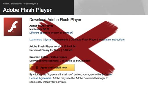
I’ve never been one to join in with the Flash hater crowd, but the fact is, that crowd is growing. Leading the masses is none other than Apple CEO and world-renowned technology clairvoyant Steve Jobs. Check out this excerpt from a recent Wired article:
“About Adobe: They are lazy, Jobs says. They have all this potential to do interesting things but they just refuse to do it. They don’t do anything with the approaches that Apple is taking, like Carbon. Apple does not support Flash because it is so buggy, he says. Whenever a Mac crashes more often than not it’s because of Flash. No one will be using Flash, he says. The world is moving to HTML5.” (Source)
Those are strong words from a man revered for leadership in the tech world. To be honest, much of what he says rings true. Online Flash content certainly isn’t the most reliable technology out there and is highly dependent upon extra software and up-to-date plugins that the user may or may not have. Further, HTML5 and CSS3 are glimpse into a future where you can accomplish a richly interactive multimedia experience with with simple, standards compliant code.
As a developer, if you join Apple in their virtual Flash boycott, you probably won’t regret it. You don’t even have to take an active stance against Flash so much as simply avoid using wherever possible. You’re pretty much guaranteed to have a lot less headaches from users who can’t view your content.
#6: Make It Friendly

For years, Apple was branded as a cult that was anything but friendly. They’ve really sought to purge this idea in recent years by restructuring their image to be more approachable. The most noticeable place you see this is in the “Get a Mac” ads. The Mac is portrayed as an every day kind of guy while the PC is the “out there” business man who’s always up to no good. Subliminally, these commercials are saying that Apple is really an open community and anyone from teenagers to grandmas will fit right in.
Another thing they’ve done is improved their formerly abysmal tech support record. Now anyone in a major city can just make an appointment at the Apple store for a free one-on-one consultation to address any problems and/or questions customers might have.
All of these techniques are reinforced by graphics of friendly, smiling faces. Currently the Apple store near me has about a dozen cardboard cutouts of Apple employees in the window as if to say “come on in, we’re happy to help.” You can also spot these smiling employees in a few places on the Apple website as shown in the pic above.
What Apple is doing is forming a balance between amazing but non-personable technology-based design and approachable smiling faces. No matter what you’re selling, consider whether it’s appropriate to make it look more friendly and think about what you can do to get it there. Even a simple “Hello” in a headline can go a long way.
#7: Use a Strong Grid
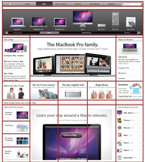
The picture above speaks for itself. Every page on Apple’s site adheres to a strict grid structure; whether simple or complicated, it’s there. The purpose? Check out how much information they’re throwing at you on the page above. There is simply a ton going on, but it somehow seems attractive instead of overwhelming.
Breaking sporadic information up into manageable cells drastically reduces visual clutter and confusion. Notice that each cell also contains a visual reference to accompany the text description. These visual references all look very similar and fit into the overall Apple theme. Even if you’re using stock images, try to maintain a similar theme so there’s no visual disparity in the pictures scattered all over the page.
#8: Create Instructional Aids
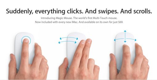
To reinforce the message that the top of the mouse is actually a multi-touch surface, Apple created the above illustration. Even without the headline, nearly anyone would be able to comprehend what’s happening in the picture and consequently understand how to use a brand new piece of technology that they’re completely unfamiliar with.
Apple goes even further than illustrations though. Nearly every piece of hardware and software on their site has an accompanying video that shows you how it works. This goes a long way to reduce tech support questions. I frequently refer my friends (who have all converted to Mac because of me and therefore see me as free tech support) to these videos because they provide a much richer and easier to understand experience than a phone conversation ever could. Check out Apple’s library of instructional videos to see how great they are for yourself.
#9: Be Consistent
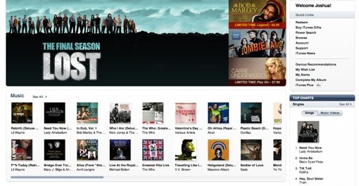
The pic above is a screenshot of the iTunes store. Look familiar? If you’re thinking it looks a lot like Apple.com, you’re right. Now have a look around Mac OS X, specifically in the Finder. Again we see strong grid-based design, lots of white, metallic textures, and blue as an attention grabber (in selections). And finally, have a look at the full Apple line of hardware to see these textures and design elements brought into the real world.
Apple’s general look or “brand essence” is applied across every single thing they design. It’s quite stunning when you realize how much their software actually looks like their hardware. How much more integrated can you get? If you’re ever tasked with the job of developing a brand, look at every aspect of the company from televised ads and websites on down to the products themselves. Consider how you can integrate all of these disparate elements to look like individual pieces of a cohesive whole.
#10: Not Just a Big Store
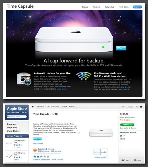
Apple is a great case study in a successful e-commerce site. Notice that the entire site is bent on influencing you to buy, and educating you about, their products. However, the site doesn’t feel like one big store.
What I mean by this is illustrated in the screenshots above. The top shot is the dedicated Time Capsule page. Apple loves making beautiful product pages with clever headlines informing you of how great their products are. Notice that this technically isn’t the “store.” If you click the buy button, you are then taken to the page in the second screen: the actual online store. Here Apple has completely stripped down the visual appeal and focused on usability. They give you the information you need without distractions and make it easy to purchase an item in a few clicks.
If you’re making a online store, your first idea will probably be to do just that: build a store. If you have the time, budget, freedom, etc., consider building a website to showcase the items in the store in a way that simply wouldn’t be efficient in the store itself. Create beautiful dedicated pages that really boost your product and include a “buy now” link that takes customers to the visually boring but highly practical store section of the site.
#11: Be Confident
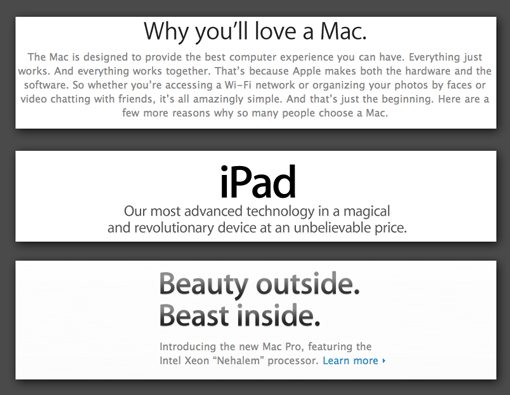
Apple uses the most confident headlines in the world
Let’s face it, Apple products are pretty amazing. Click around Apple’s site for a few minutes and you’ll find they aren’t exactly humble about this. Their headlines are filled with adjectives like beautiful, powerful, fun, revolutionary, easy-to-use and advanced. Their product descriptions inform you that the item is the best thing available in its category. If you overanalyze it, this may sound a bit haughty. However, as a casual visitor, you would probably just be impressed.
Whether your website is advertising a product, service, or simply an idea, don’t sell yourself short. Never use the word “good” when you can say “great,” never say “attractive” when you can say “beautiful.” If you are confident in your product, really strive to communicate it to your visitors. You’ll find that it will rub off on them and that they will generally have a much more positive first impression if everything on your site is focused on convincing them how great you are.
Like anything, there is of course a breaking point. Have someone not involved with the site read over your copy to make sure you aren’t pouring on the self-praise so thick that it becomes an annoyance.
#12: Put Legal Copy in it’s Place
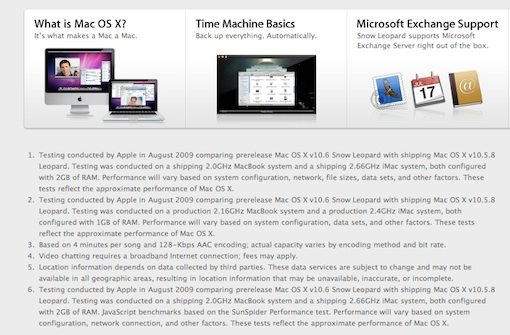
This one is small but important. If you’re working for a company big enough to have a legal department, you know that the people in legal departments work really hard to prove that they aren’t worthless. Usually what this means is that you as a designer create something, send it to the legal department and get back a 500 word document full of extra content you are required by law to include. Inevitably, cursing ensues.
What you do with this content is important. Consider whether or not it’s information that the user actually wants to know or if it’s just an evil necessity that no one will ever read. If it’s the latter, take a page out of Apple’s book (a bite out of the Apple so to speak) and throw it at the very bottom of the page in a small but readable font that doesn’t contrast with the background too much. Your primary goal as an employee should be to make this content accessible, findable and readable. However, your goal as a designer is to make sure it doesn’t screw up your design by filling it with unimportant clutter.
#13: Comprehensive Footer Site Navigation

Check out the footer in the screenshot above. Apple has transformed the bottom of each page into an extremely helpful navigation tool. This is a great way to reduce the difficulty of navigating a large site. Rather than filling their primary navigation with a link to every section on the site, they’ve reserved it for general categories. Within a category, if you scroll down to the bottom of the page you find a much more comprehensive site map in the footer.
Notice they haven’t gone out of their way to make it stick out. It’s enough that you can spot it if you’re looking for something but subtle enough that you don’t give it a second glance if you don’t need help with navigation.
#14: Create Beautiful Custom Icons
![]()
With the introduction of OS X, Apple brought icons into a whole new realm. Since then stunning icon design has flooded operating systems and spilled over onto the web. However, there are a few free icon sets online that have reached such fame that they’ve become cliché.
So before you go downloading a set of icons that looks like everything else on the web, give it a go yourself. Fire up Photoshop and/or Illustrator, dust off those drawing skills and make yourself some great custom icons. In the end they’ll really polish off your site designs. As you master the art of good icon design you’ll notice that you are a lot less dependent on third party art to produce amazing sites (which is a really good thing). If anything, you’ll save those crazies in the legal department from trying to figure out the legal restrictions on all those “free” icons.
#15: Interactive & Dynamic Content

Nearly every page of Apple’s site contains an automatic slideshow, an animated accordion menu, a video, or an interactive photo gallery. The goal here is to keep the attention of the user. Static content can be a little on the boring side and can cause a user to vacate the site in search of something more interesting. Apple keeps your attention by giving you lots of pages with constantly changing content or bits of interactive features.
This kind of content should be approached with extreme caution for a number of reasons. First of all, it’s easy to leave over half of your visitors behind if you’re programming in features that require a special plugin. Try to stick to widely supported technologies that work across multiple browsers. Also, it’s really easy to get carried away with dynamic content. There’s an extremely fine line between eye-catching and annoying and you absolutely must learn where that line falls. Otherwise you give visitors a headache in place of the good impression you were going for.
One More Thing…
To sum up, Apple Inc. is pretty much synonymous with classy design. There’s a lot we can learn from observing these great designers at work that goes way beyond just ripping off the cool reflections they put on everything. The tips above are meant to be generally applied to your own work in a unique way. Use them as inspiration to blaze your own path in great site design.

